

In Google Sheets, adding a vertical line to a chart can be useful for visually highlighting key points, such as a target, a milestone, or an average value. This can make your data presentations more impactful and easier to understand by drawing attention to specific moments within your data timeline. Whether you are tracking project deadlines, comparing different phases of data, or emphasizing an important threshold, a vertical line can help your audience quickly grasp the significance of particular points on your chart.
This tutorial provides a straightforward approach to inserting a vertical line in a line chart within Google Sheets. It’s designed to help users who may not be familiar with advanced chart customization techniques. By following this guide, you’ll learn how to effectively add a vertical line, enhancing your charts’ clarity and making your data more visually compelling. This simple yet powerful feature is ideal for anyone looking to improve the readability and effectiveness of their Google Sheets charts.
Step 1: Entering the Data
To begin creating a line chart in Google Sheets, first enter your data into the spreadsheet. Ensure that your data is organized in a clear table format with labels in the first row for each column.
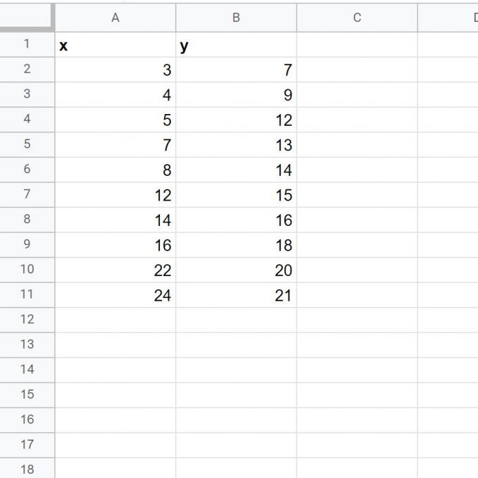
For example, enter dates in one column and corresponding values in the next. This structured format will allow Google Sheets to accurately plot your data points when you create the chart.
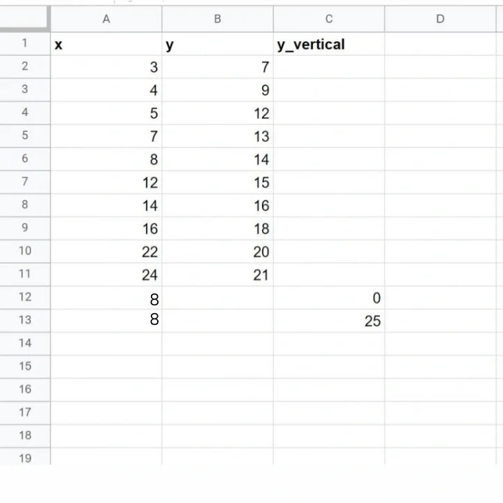
Step 2: Adding the Data for Vertical Line
To add a vertical line at x = 8 in your line chart, create a new column specifically for this value. In this column, input data for the point where x equals 8, such as the corresponding value you want to highlight, and leave the rest of the column blank. This will ensure that a vertical line appears at x = 8 on your chart.
We can also add in the following artificial (x, y) coordinates to the dataset as:
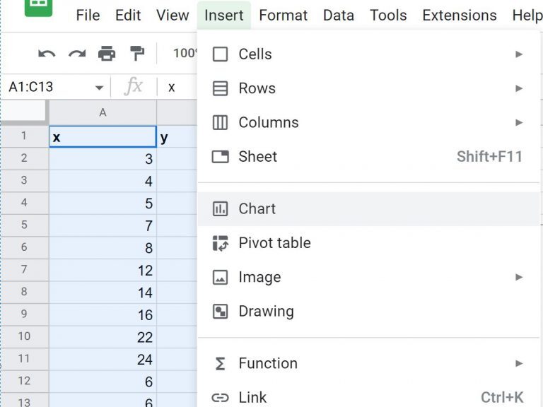
Step 3: Creating Line Chart with Vertical Line
Once you’ve set up your data and added the column for the vertical line, the next step is to create the chart.
•To do this, first, highlight the cells containing your data, including the column for the vertical line.
For example, if your data is in the range A1:B10 and the vertical line data is in column C, highlight A1:C10.
•Next, go to the top ribbon and click on the “Insert” tab. From the dropdown menu, select “Chart.”
•This will open the Chart Editor, where Google Sheets automatically generates a chart based on your selected data.
•You can then customize the chart type and other settings to display your data clearly and effectively.
The line chart will be generated automatically based on the data you’ve selected.
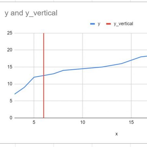
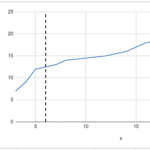
Notice that the vertical line is positioned at x = 8, which was specified at the end of our original dataset. The line extends vertically from y = 0 to y = 25, as defined in the dataset.
If you want to adjust the height of this line, simply modify the y-values in your dataset to reflect your desired starting and ending points. This flexibility allows you to customize the vertical line to suit different ranges, making it easier to highlight specific areas of interest on your chart.
Step 4: Customizing the Chart (Optional step)
You can easily customize the color and style of the vertical line by double-clicking on it to make it more visually appealing.
Conclusion
In conclusion, creating a vertical line graph in Google Sheets is a valuable skill for effectively visualizing and analyzing data trends. The process begins with careful data organization. Ensure your data is structured with clear labels, typically featuring one column for X-axis values (such as time periods or categories) and another for Y-axis values (numerical data). Accurate data preparation is crucial for generating meaningful insights from your graph.
Once your data is organized, the next step is to insert a chart. Highlight the range of data you wish to include and navigate to the “Insert” menu, then select “Chart.” Google Sheets will automatically generate a default chart based on your data. To convert this into a vertical line graph, access the Chart Editor pane, which appears on the right side of the screen. In the “Setup” tab, change the chart type to “Line chart” from the dropdown menu. This adjustment will convert your default chart into a line graph that displays trends over time or categories.
Customization is key to making your chart visually appealing and easy to interpret. Use the “Customize” tab in the Chart Editor to modify line color, thickness, and marker styles. Adding descriptive axis titles and formatting the chart area enhances clarity and ensures that viewers can easily understand the data presented.
Finally, review your graph to ensure that it accurately represents your data and is visually clear. Once satisfied, save your changes. The resulting vertical line graph will effectively illustrate data trends, making it a powerful tool for both analysis and presentation. By following these steps, you can leverage Google Sheets to create informative and visually engaging graphs that facilitate better data understanding and communication.