
Charts In Google Sheets is a useful tool, it not only helps to give the information in an arranged way but also makes your sheet look attractive. Your data in the form of a Table looks more organized rather than that presented in the form of sheets. Complex data is simplified and then presented in a graphical format to make it easy to understand by people. Charts can easily show important facts and information which has to be remembered. Google Sheets provides different chart options for your data, it even provides chart suggestions for the selected data. Google Sheets is an alternative to Excel, it provides so many new automotive options to make the work of users less helpful. The Benefit of Using Charts in Google Sheets is that it automatically updates the charts as you make changes in the data present in the cells.
A Variety of charts are present in Google Sheets, you can choose as many, of the charts you want to insert in your sheet document.
Google Sheets has a feature to automatically generate graphs (suggestions) according to your document. This feature is very helpful to users, it makes their task quick and easy.
To Automatically add Graphs in Google Sheets.
Google Sheets allows you to choose from a variety of charts, whether it is a line graph a pie chart, or something else, you can add it to your Google Sheet document.
So, to automatically add charts you have to simply open your Google Sheets document.
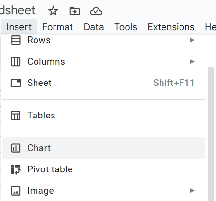
If you already have a sheet with some data within it, then simply just click on Insert and then select the chart option from the menu. A blank box appears on your sheet. you can resize it and drag it to your desired location.
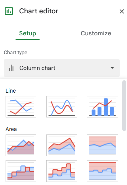
In the Chart Editor window Click on Setup then select the chart type you want to insert in your document.
Some of the main categories of charts are: Line, Column, Scatter, Area, Bar, Pie, Map, and Many More.
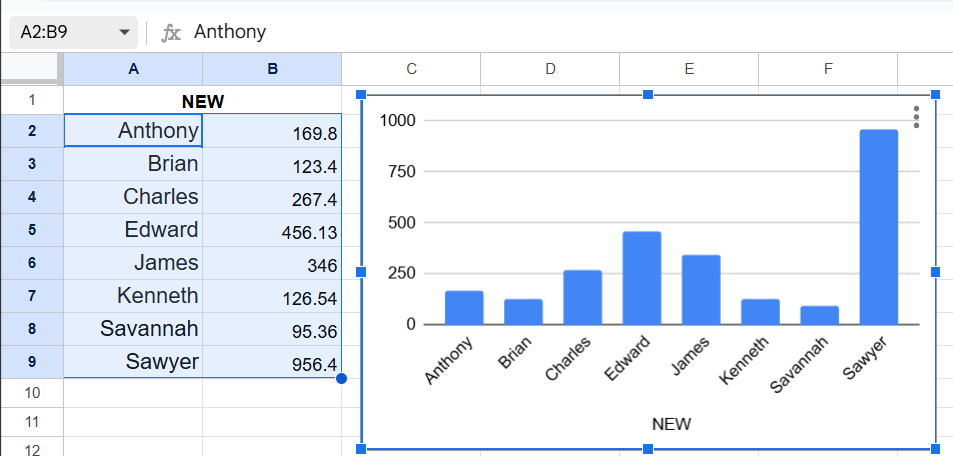
Select the range of cells of which you want to make the chart.
Your chart will now appear in that white box.
Now your Chart will appear like this: –
Customize your Chart
The Chart Editor in Google Sheets also allows you to change the formatting of your chart. You just have to simply choose the Customize option and This allows you to Customize, change formatting, add titles, Highlight, change color, names, add columns, and many more things, according to your needs.
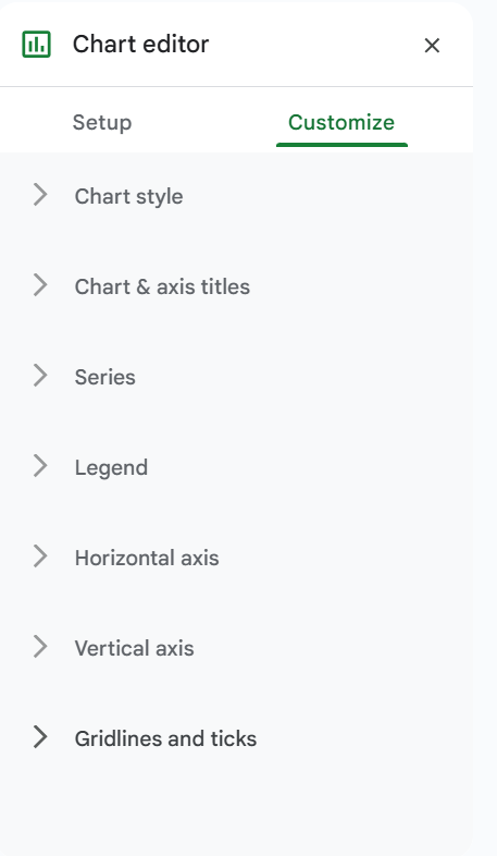
These are the options you can edit in your chart.
Chart Style Option allows you to add Background Color, and Font to make your chart look attractive and to gain the attention of the viewers. Chart Border color, Maximize, minimize, make it in 3D, and compare with others.
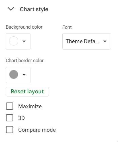
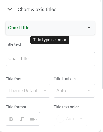
Chart & axis titles option allows you to add a Chart title, chart subtitles, and Horizontal and Vertical axis titles.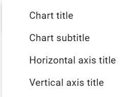
You can also change font theme, title text size, format, and more.
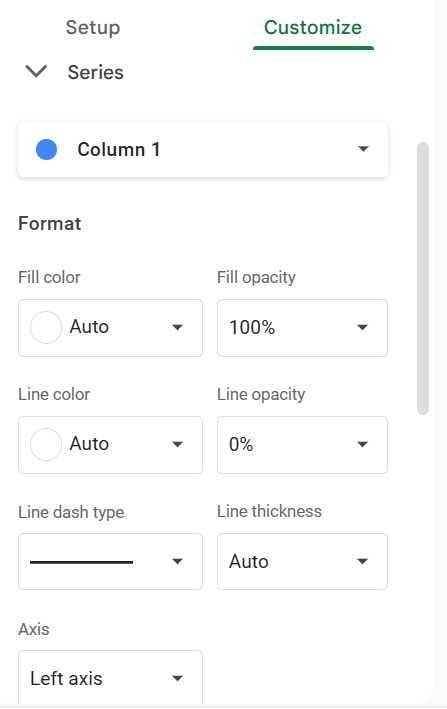
Series Option under the customize tab allows you to format columns present in your table.
you can change the color of your column, change your Line Color, edit line type, and line Thickness, and Edit your column in your chart.
Here you can also change the side of your axis i.e. Left axis or Right axis.
this enhances your chart appearance.
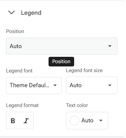
Legend Option allows you to add legends to your chart and edit them, you can edit Legend font, Legend font size, Legend format, and Text Color from this menu. You can also change the Position of legends present in your chart.
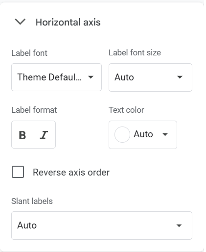
From the Horizontal axis option, you can edit the details of the axis of your chart, you can change the font, and add color. Change labels, Reverse axis.
You can edit the Horizontal Axis.
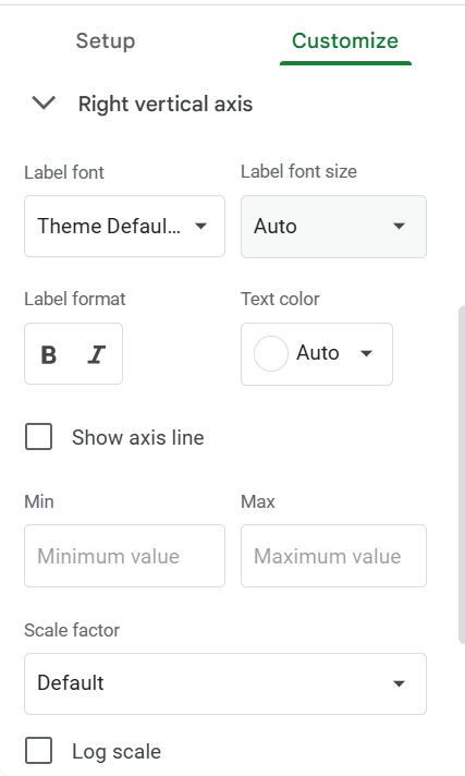
From the Right vertical axis option, you can Edit all the details of the vertical axis in your Chart.
You can add a font, and label, edit the font size, change the label format, and change the text color.
You can also add the minimum value and maximum value of the axis
You can Customize the vertical axis.
Gridlines and Ticks options allow you to add a grid, change line spacing, grid color, and Show you the grid spaces.
By this, You can add edit grids and lines to your table and make your table attractive.
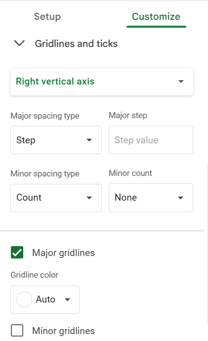
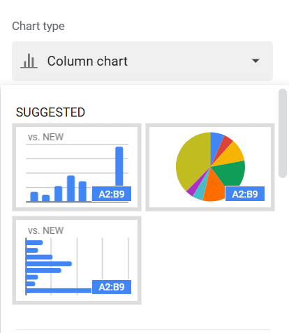
Chart Suggestion
Google Sheets suggests inserting a line chart, a pie chart or column chart.
Google Sheets gives you Chart Suggestions when you choose a chart It Gives you preformatted charts that you can add directly to your sheet document.
After You Select the range of data you want to input in your chart google sheet provides you with some of the good, already-made charts according to your data.
And That’s all about Charts in Google Sheets.