

Google Sheets also has a feature that allows you to add radar charts to your spreadsheet document.
What is a Radar Chart?
A Radar Chart also called a Spider chart is a simple two-dimensional graphical representation of data having multiple variables, represented in a radar form. in this type of chart, each variable is joined with the center. This chart is mostly used to display performance analysis or analytical data. Radar Charts are useful in survey data when you can not link the data variables directly. Radar Chart gives a viewer data visualization experience. There is a huge difference between radar charts and column charts, Radar Charts show multiple variables, helpful when have to deal with a complex dataset.
Creating a Radar Chart in Google Sheets
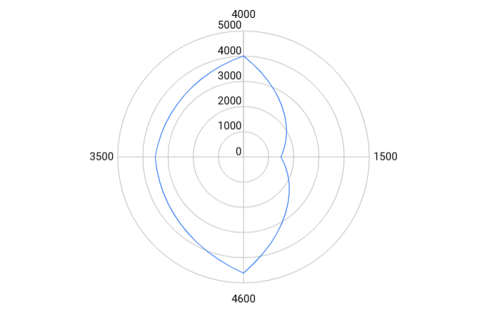
Here above us an example of a radar chart made in Google Sheets.
Create a Radar Chart
To create a Radar Chart in Google Sheets, the first step you have to take is to Open your Google Sheets and create a data table in your data.
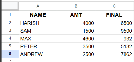
Select the range of data you want to use in your Google Sheets Radar Chart, the data should be arranged in a proper and clean manner. This easily creates the Radar Chart.
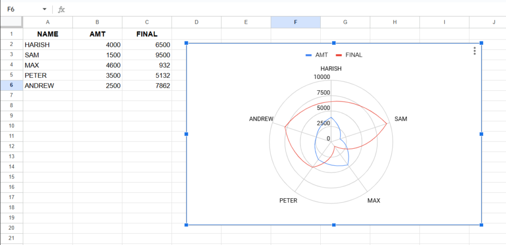
Select the entire data then create the chart. Select the chart option under the Insert menu.
Now Google Sheets will create a data graph by default, then you have to select Radar Chart under the chart type option.
Now, a radar chart is created in Google Sheets of your selected range of data. Now as the chart is created you can edit the chart according to your choice.
Here is my data the chart is given below as a radar chart is created of the data used in the range of cells.
Here in the given example, we have created the table of data in the cell and then created a Radar Chart in Google Sheets. The Radar Chart is created on the basis of verticle data present in the sheets.
You can edit your chart according to your own personal choice, of how you want to show your chart.
Customising Radar Chart in Google Sheets.
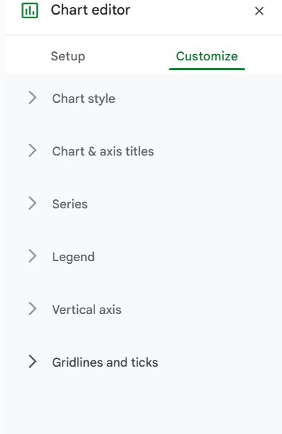
Any chart made by you in Google Sheets or in any other application requires you to customize the chart. you have to create the chart title and chart axis according to your choice you can edit the chart view in the customize tab of the chart editor sidebar panel.
you can open the chart editor just simply by double-clicking on the chart created.
Options available for customizing the chart are:
- Chart Style
- Chart and axis titles
- Series
- Legend
- Vertical axis
- Gridlines and ticks
Above are the options present under the customize option in the chart editor.
In Chart Style, you can edit the background color, font, and chart border color. this option is the same in all types of chart.
Under Chart and axis titles you can add chart titles, can change chart title font, font size, title format color, etc.
Series, In this option you can edit the color, line type, font, thickness, capacity, etc of the format series. means it changes the line alignment present in your chart. And can also change the type of axis, lift axis or right axis, horizontal or vertical axis.
Legend, You can change the position, font, font size type color of the legends present In your chart.
Vertical Axis, You can add the minimum and maximum value of the verticle axis of your chart, can change the scale factor and number formate of the vertical axis of your chart.
Gridlines and ticks, you can edit the spacing, line spacing, and count of the lines percent i both the axes, vertical axis or horizontal axis. You can add the grid in your chart sheet, Radar Chart.
After customizing the chart, your chart will look different from the chart before.
That’s all you have to do to create the Radar Chart in your Google Sheets. Radar Charts are very useful for companies for data analysis or data present with multiple variables. These types of charts are useful for companies to show their performances. These charts make it easy for the user to make a comparison of your data.
Here it is all about creating a radar chart in Google Sheets.